Introduction to Flexbox
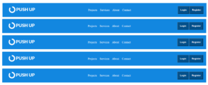
When it comes to building responsive layouts, Flexbox offers a powerful and flexible way to achieve complex designs with minimal code. In this post, we will guide you step-by-step to create a responsive navigation bar using Flexbox in HTML.
HTML
index.html
<!DOCTYPE html>
<html lang="en">
<head>
    <meta charset="UTF-8">
    <meta name="viewport" content="width=device-width, initial-scale=1.0">
    <title>Document</title>
    <link rel="stylesheet" href="css/style.css"/>
</head>
<body>
        <div class="container">
            <div class="logo">
                 <img src="images/push.png" width="230px" height="50px"/>
            </div>

            <div class="navlinks">
                    <a href="#">Projects</a>
                    <a href="#">Services</a>
                    <a href="#">About</a>
                    <a href="#">Contact</a>
            </div>

            <div class="button">
                    <button class="nav-button">Login</button>
                    <button class="nav-button">Register</button>
            </div>


        </div>


</body>
</html>
CSS
style.css
body{
    margin: 0;
    padding: 0;
    justify-content: center;
    font-family: 'noto Sans';
    display: flex;
}

.container{

  display: flex;
  justify-content: space-between;
  width: 100%;
  height: 100px;
  background-color: rgb(18, 135, 224);
  align-items: center;
  padding: 0 50px;
  gap:30px;
  color: white;

}

.navlinks{
    display: flex;
    gap: 20px;
}
.navlinks a{
    text-decoration: none;
   color: white;
   font-size: 20px;
}

.nav-button{
    padding-left: 1rem;
    padding-right: 1rem;
    padding-bottom: 1rem;
    padding-top: 1rem;
    border-radius: 2%;
    font-size: 1rem;
    font-weight: bold;
    background-color: rgb(3, 80, 139);
    color: white;

}